Dumo design system
The design foundations and components behind every app screen, taken from the client's prototype and screen designs. The app uses a single warm dark theme because it is a video app. Developers map these tokens straight into Flutter's ThemeData.
Brand
The "d" mark holds a teal play button with an amber spark: a creator's moment of fame. The wordmark is set in Bricolage Grotesque ExtraBold, with "THE FAME" in widely letter-spaced capitals.
App icon
 96 dp48 dp32 dp
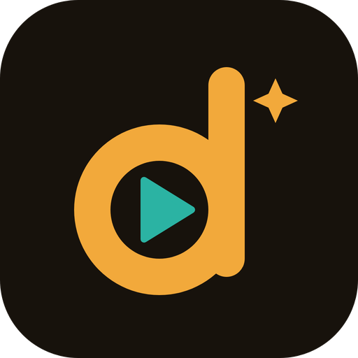
Android adaptive icon: the "d" mark sits on a #17120C background layer. Keep the mark inside the central 66% safe zone so launcher masks don't crop the spark.
Usage rules
- Clear space around the logo is at least the height of the "d" bowl's inner circle.
- Minimum size: the icon at 24 px, the wordmark lock-up 120 px wide.
- In the app, the wordmark is plain lowercase "dumo" text in amber (#F2A93B) at 26 px in the feed header.
- Don't recolour, stretch, outline or place the logo on busy video frames without a scrim.
Colour
Warm near-blacks instead of pure black, so the app feels like a lounge rather than a void. Amber is the only call-to-action colour. Teal stands for money coming in and for Data Saver being active.
Contrast notes
- fg #FBF6EC on bg #17120C: about 17:1 (AAA). muted #C9B99F on bg: about 9.7:1 (AAA). Muted is safe for small helper text.
- ink #17120C on amber #F2A93B: about 9.3:1. Text on amber buttons is always ink, never white (white on amber is about 2:1 and fails).
- teal #7FE0CF on bg: about 12:1. Use it for positive amounts (+R356.20) and active Data Saver.
- coral #E4572E is used only for the filled "liked" heart and destructive actions. As text on bg it is about 5.1:1, which passes AA for body text.
- Text over video always sits on a 35–45% black scrim at the top and bottom of the screen.
Typography
Two families from Google Fonts, both under the OFL licence and free for commercial use. Bricolage Grotesque gives Dumo its loud, confident voice. DM Sans keeps the interface calm and readable on small screens.
Numbers in money and stats use tabular figures (font-feature-settings: 'tnum') so columns line up. Respect Android font scaling up to 130% without truncating buttons.
Spacing, radii & elevation
Spacing: 4-pt grid
Screen gutter 16. Section gap 18–24. Gap between items in a list 10–12. The bottom tab bar adds the Android gesture-bar inset.
Corner radius
badge, chip
button, input
tile, gift
card
sheet top
pill, avatar
Elevation
Dark UIs show depth through surface colour, not shadow: bg #17120C (base) → panel #241B12 (raised tiles, inputs) → sheet (bg plus a 1px #3A2E20 top border over a 55% black scrim). Only toasts get a drop shadow (0 8 24 / 40% black), because they float over video.
Iconography
Line icons on a 24px grid with a 2px stroke and round caps and joins, matching the prototype. Filled versions are used only for state (a liked heart). Use Lucide (ISC licence) as the source set in Flutter via lucide_icons, or export SVGs.
Components
These are rendered live with the app's dark tokens. The App prototype uses exactly these parts.
- Vuvuzela from @kasi.kitchen+R7.00
- Views · week 4+R212.40
Accessibility
Touch
Every tap target is at least 44 × 44 dp (48 dp is the Android default). The rail icons are 30–32 dp with padding added to reach 48.
Contrast
Text is at least 4.5:1 (3:1 for 18 px bold and above). Text over video always sits on a scrim. State is never shown by colour alone: a liked heart is filled as well as coloured.
Screen readers
Every icon button has a TalkBack label ("Like, 48.2 thousand", "Send a gift"). Feed videos announce the creator and caption. Sheets move focus into the sheet and return it when closed.
Captions
Captions are always visible text. Auto-subtitles ("Go Global") are a later phase. Creators are encouraged to put key words in the caption.
Reduced motion
When Android's "Remove animations" setting is on, sheets and toasts appear without sliding, and the feed snaps to the next video instead of animating.
Text size
Layouts hold up at 130% font scale. Buttons wrap to two lines rather than cutting off text.
Motion
| Interaction | Duration | Curve | Notes |
|---|---|---|---|
| Feed swipe to next video | 350 ms | ease (Curves.easeOutCubic) | Snap paging. The next video is already buffered. |
| Bottom sheet in | 250 ms | ease-out | Slides up 40 px and fades in from 60%. The scrim fades over 200 ms. |
| Like | 300 ms | spring (scale 1 → 1.25 → 1) | Light haptic tap. A double-tap on the video also likes it. |
| Toast | 200 ms in / 3.2 s hold | ease-out | Sits above the tab bar. Only one at a time. |
| Tab switch | 0 ms | – | Instant. No animation between main tabs. |
Data Saver patterns
South African mobile data is expensive. Data Saver is a promise to the user, so it must be visible, honest and simple to control.
Always visible
The pill in the feed header shows the state. When it is on, the icon is teal. One tap toggles it, and the setting is also in Settings.
Honest estimate
Show an estimate of data use under the pill: "about 4 MB per min" (saver on) or "about 12 MB per min" (off). Label it as an estimate.
What it changes
Plays the low-bitrate rendition (about 360p), preloads 1 video instead of 2, loads smaller thumbnails, and defaults uploads to Wi-Fi only.
Voice & content
How Dumo talks
- Plain, warm, proudly South African, never corporate. Short sentences.
- Speak to creators as partners: "You earned R7.00", not "Revenue credited".
- Local words where they come naturally (Mzansi, kasi, gogo). Never as a gimmick.
- Errors say what happened and what to do next: "That code didn't work. Check the SMS and try again."
- Test money is always labelled. Never imply that real money moved.
Formats
- Rand: R1,284.50. R prefix, no space, comma for thousands, always 2 decimals in the wallet.
- Counts: 48.2K, 1.9M (one decimal, uppercase K/M). Exact numbers under 1,000.
- Dates: "Fri 2 Oct". Times: 24-hour, "14:30".
- Phone: +27 82 555 0142, masked as 082 *** 0142.
- Languages: use each language's own name: isiZulu, isiXhosa, Afrikaans, Sesotho, Setswana…
Flutter handoff
Tokens → ThemeData
DumoColorsThemeExtension holds every colour token.ColorScheme.dark(primary: amber, onPrimary: ink, surface: bg, …)TextTheme: displayLarge/Medium/Small = Bricolage 800. titleMedium/labelLarge/bodyMedium/bodySmall = DM Sans. Fonts are bundled in the app, not loaded at runtime.DumoSpacingandDumoRadiiconstants mirror the scales above.- Component widgets: DumoButton, DumoPill, DumoBadge, DumoSheet, DumoToast, DumoTile, StatRow, ActionRail.
Strings in one file
All text lives in lib/l10n/app_en.arb (the brief requires all app text in one file). There are no string literals in widgets, and a lint check enforces this.
{
  "walletTitle": "Wallet",
  "walletTestBadge": "TEST MONEY",
  "giftSent": "{gift} sent. {handle} just earned {amount}.",
  "@giftSent": { "placeholders": { "gift": {}, "handle": {}, "amount": {} } }
}